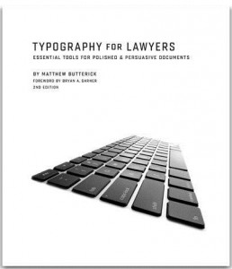
 Typography for Lawyers by Matthew Butterick is now in its second edition. With this book the author – a typographer turned lawyer – has performed a service for lawyers that no-one else has done for other professions. Go on, Google “typography for” and see what you come up with.
You have to be a lawyer seriously concerned about the effect of print on page to get “typography for lawyers” and unfortunately most lawyers are not; rather they care about the law and lawyering – or at least their little corner of the law and lawyering. Fair enough; they’re lawyers first and foremost. But typography matters an awful lot to how lawyers project themselves on the page, to other lawyers, to clients or to the courts; and that’s Matthew’s message: lawyers, more than most other professions, are publishers and should be held to the same standards as professional publishers.
With modern word processing applications and print technology we have sophisticated systems capable of producing high quality, “polished and persuasive”, professional documents. There is no excuse for using them as if they were typewriters upon which all those archaic rules and conventions are based.
So lawyers should buy this book. They need to know about the difference between straight and curly quotes, different types of dashes and different types of spaces. They should learn once and for all why you shouldn’t put two spaces after a full stop or start a new paragraph by hitting the return key twice; and why you almost never should underline stuff or type in ALL CAPS. And there’s 101 more easily-digestible, well-illustrated rules and tips in this book’s 240 pages. Although there are many references and examples from US practice, it’s not difficult to relate them to UK equivalents.
The second edition covers new topics such as email, footnotes, alternate figures, and OpenType features; advice for presentations, contracts, grids of numbers, and court opinions; technical tips covering the newest versions of Word and WordPerfect for Windows and OS X; and new essays on the font copyrights, screen-reading considerations, and typographic disputes that have reached the courts.
Even if most lawyers won’t hear or care about this book, in a professional firm there should be at least one person who does. There must be someone responsible for setting standards? Setting up suitable templates and styles for standard use in a firm – armed with the wealth of advice and detail in this book – will go a long way to improving the professionalism of a firm’s print output and save users time.
Matthew Butterick is an attorney and typographer living in Los Angeles. Typography for Lawyers is published by Jones McLure at $30 plus $21 shipping to the UK. You can view excerpts at typographyforlawyers.com.